Spectro, a project management tool for solo product builders working with AI.
Spectro
Mar - May 2026


App Settings is the surface where OutSystems developers configure their apps inside Service Studio, replacing a fragmented experience and the dependency on hand-written JavaScript with a single structured system that scales across app types, platforms, and plugin integrations, that happens in the same place. This case is about redesigning that surface from the ground up: the object model that anchored it, the architectural decisions that made it scalable, and the validation that confirmed it could absorb everything coming next.
OutSystems is a low-code platform where developers build mobile apps, web apps, and library components through a visual IDE called Service Studio. Apps target multiple platforms, consume external plugins, and behave differently depending on type and deployment context.
For most of the platform's history, configuring a mobile app meant Extensibility Settings: a JavaScript layer where developers manually mapped keys and values to control mobile behaviors like screen orientation, status bar color, or hardware permissions. By 2024, nearly 50% of all production mobile apps still depended on it. Asking developers to hand-write configuration files is the opposite of what a low-code platform should require.
From a UX perspective, the conflict was obvious: a low-code platform depending on a high-code solution for one of its most critical features. After internal articulation and collecting user feedback, I managed to get an experiment added to the roadmap: a low-code interface for the most used mobile settings, the Mobile tab.
The experiment worked. Developers adopted the Mobile tab quickly, but it was a limited solution, capped at six settings. When the need to bring new settings into that experience emerged, the Mobile tab couldn't absorb them. That confirmed what the experiment was designed to test: there was real demand for a low-code settings interface, and what the platform needed wasn't a bigger tab but a proper system to handle it.
Before touching any UI, I partnered with engineering to map the full configuration ecosystem: how settings were defined, stored, and retrieved internally, what logic controlled visibility per app type, and how the Extensibility layer handled what the native UI couldn't. The key finding was that the internal architecture was more flexible than the current UI suggested. Settings could be dynamically rendered based on context. The UI was the constraint, not the system beneath it.
I queried telemetry data to validate assumptions and sharpen the scope. Three findings shaped specific design decisions.
Not a power-user edge case, almost half the production base still depended on hand-written JavaScript, confirming the scale of the opportunity. The 25% platform split directly determined the interaction model: shared value by default, split into two when the developer needs it. And credentials making up half of all settings meant security and clear labeling needed to be first-class concerns, not afterthoughts.
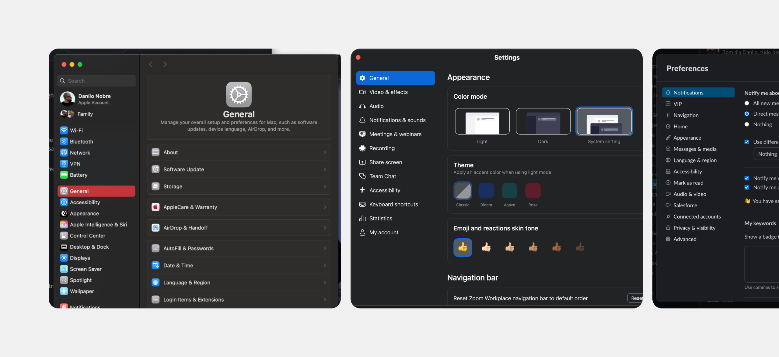
I studied how VS Code, Xcode, macOS System Settings, Slack, and Zoom handle complex, growing configuration surfaces. The goal wasn't to copy patterns, it was to understand what conventions experienced developers already know how to navigate.
The consistent signal was sidebar-based navigation with progressive disclosure: settings organized by section, with only the relevant sections visible for the current context.
To pressure-test the emerging direction, I ran a workshop with two separate cross-functional groups, UX designers, PMs, and engineers, some from outside the mobile team entirely. The groups worked independently, with no exposure to the system mapping I had done or the direction it pointed toward.
Both arrived at the same conclusion: the right solution wasn't to extend the Mobile tab or create parallel tabs for each app type. It was to redesign the dialog from the ground up as a single, scalable home for all app configuration, regardless of app type. The workshop also produced specific ideas that made it into the final design: a preview capability for settings and refinements to how Forge plugin settings should be surfaced.
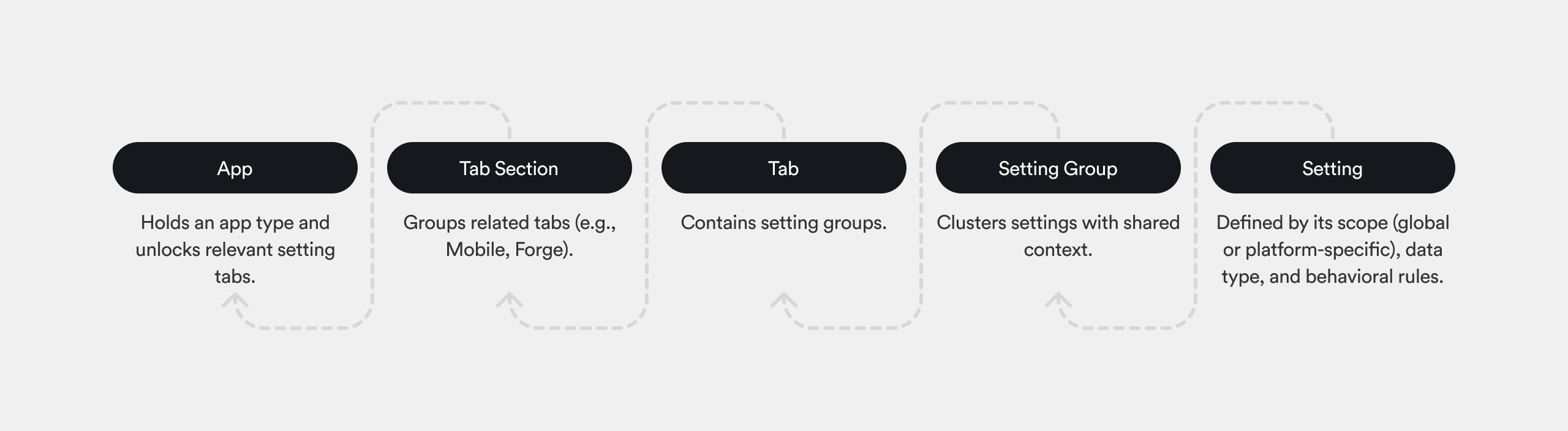
The organizing principle was to treat this as a settings system, not a settings screen. A screen is designed once. A system accommodates things that don't exist yet, new app types, new plugin categories, new platform-specific behaviors, without requiring a redesign every time.
Four rules followed from that. Progressive contextualization: developers only see settings relevant to their current app type. Consistent but flexible layout: the visual system supports text inputs, toggles, multi-selects, and plugin-injected components within a single coherent structure. Clear grouping and hierarchy grounded in the object model. And sustainability: every UI rule was evaluated against the question, can a new setting be added here in six months without breaking anything?
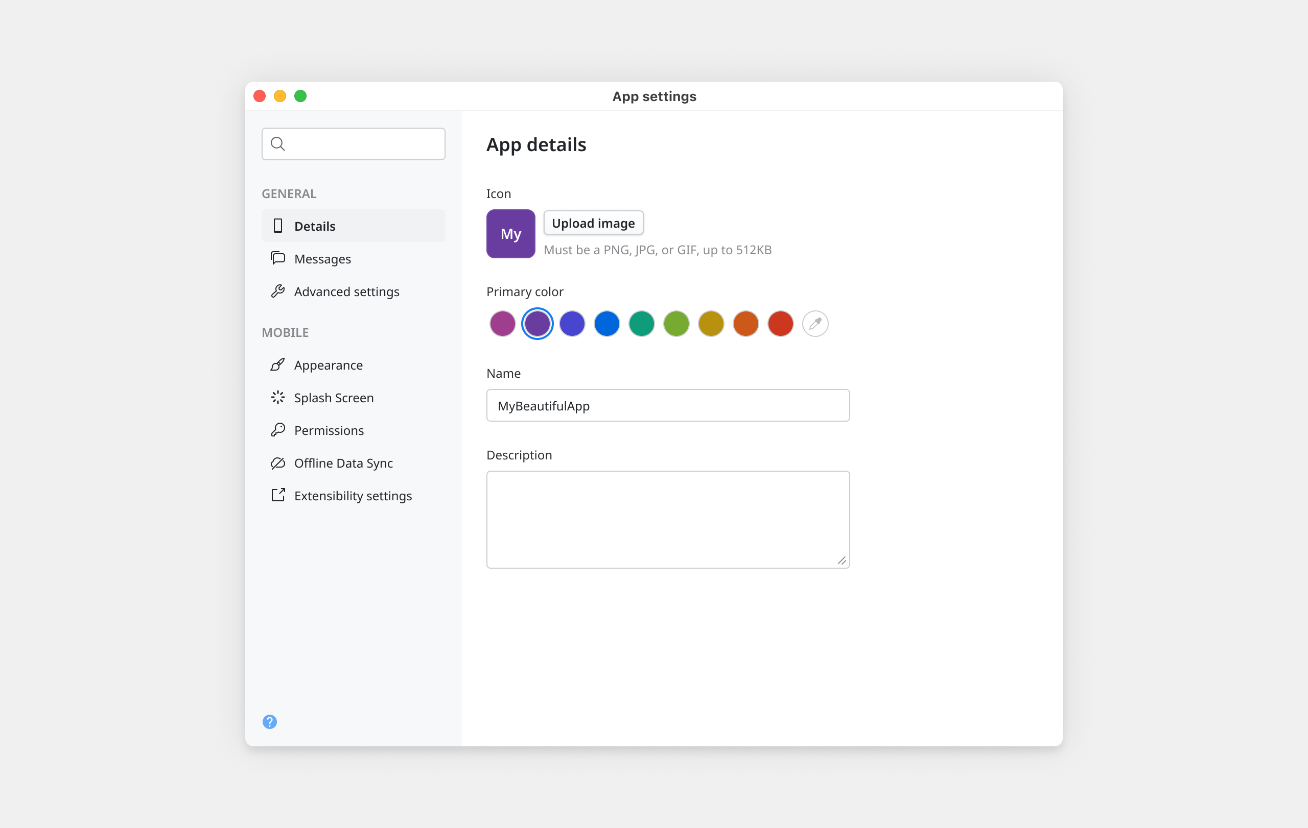
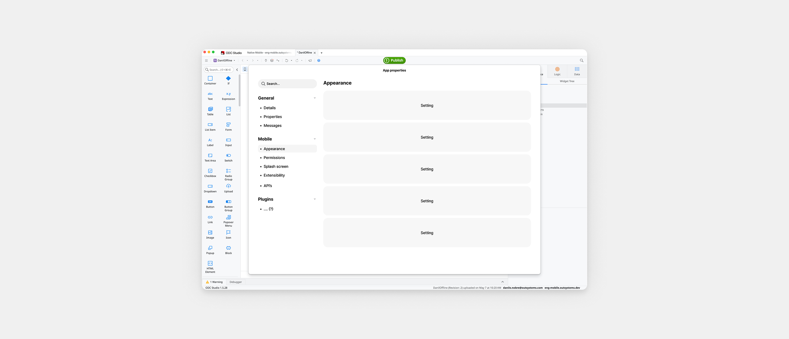
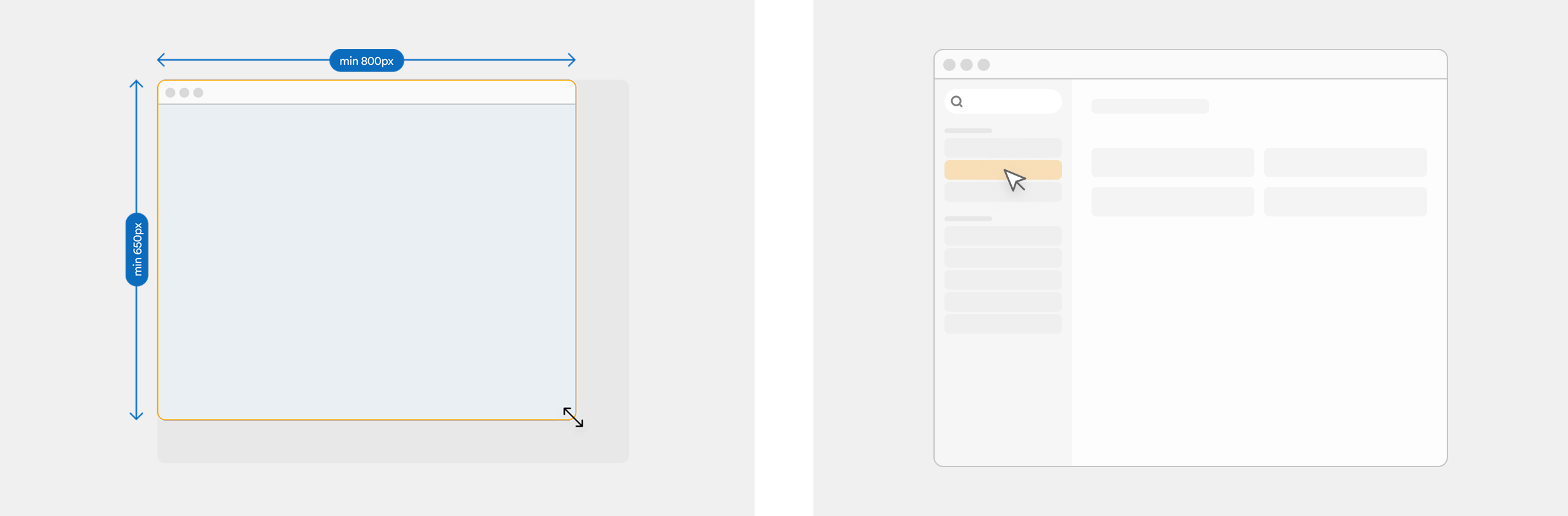
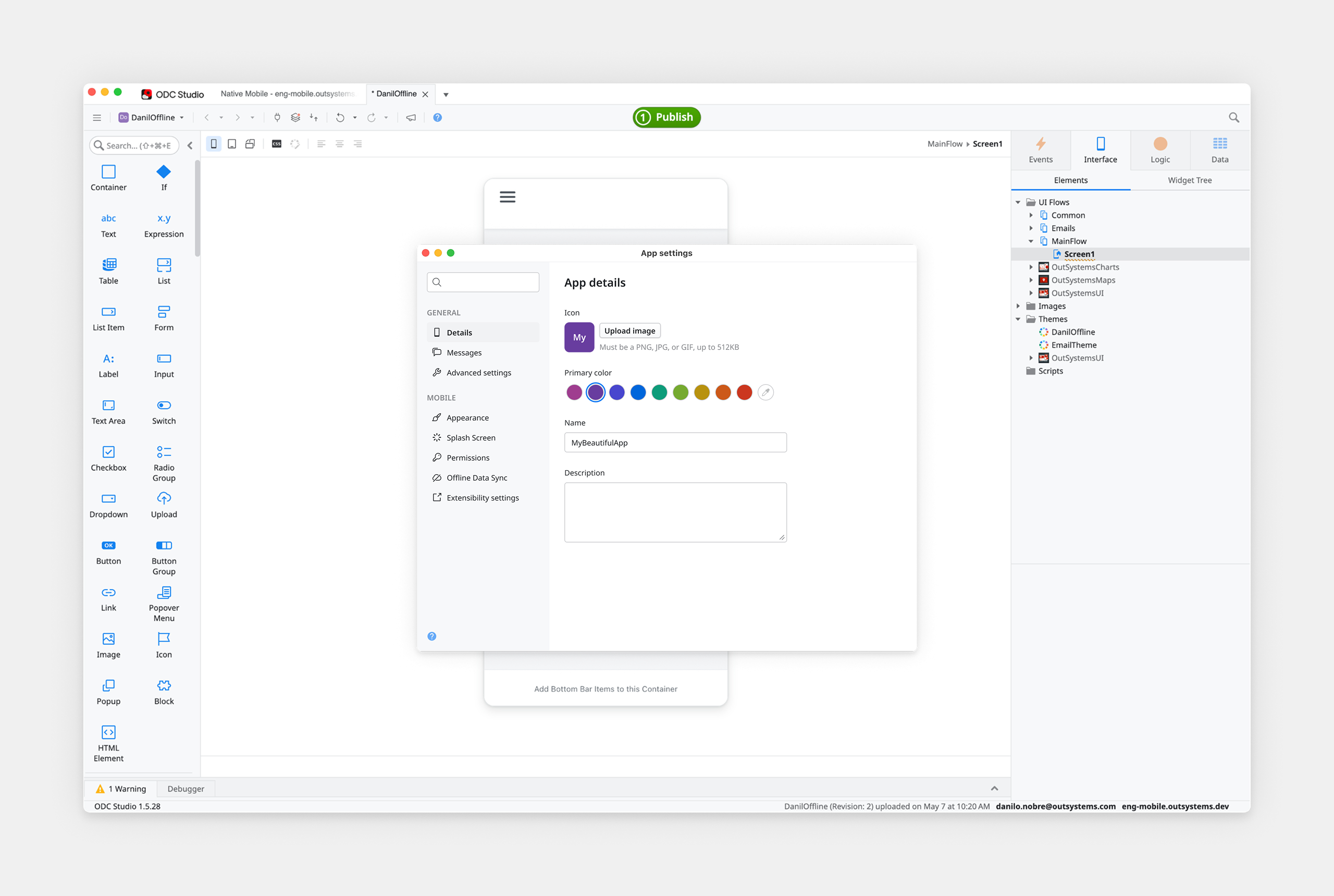
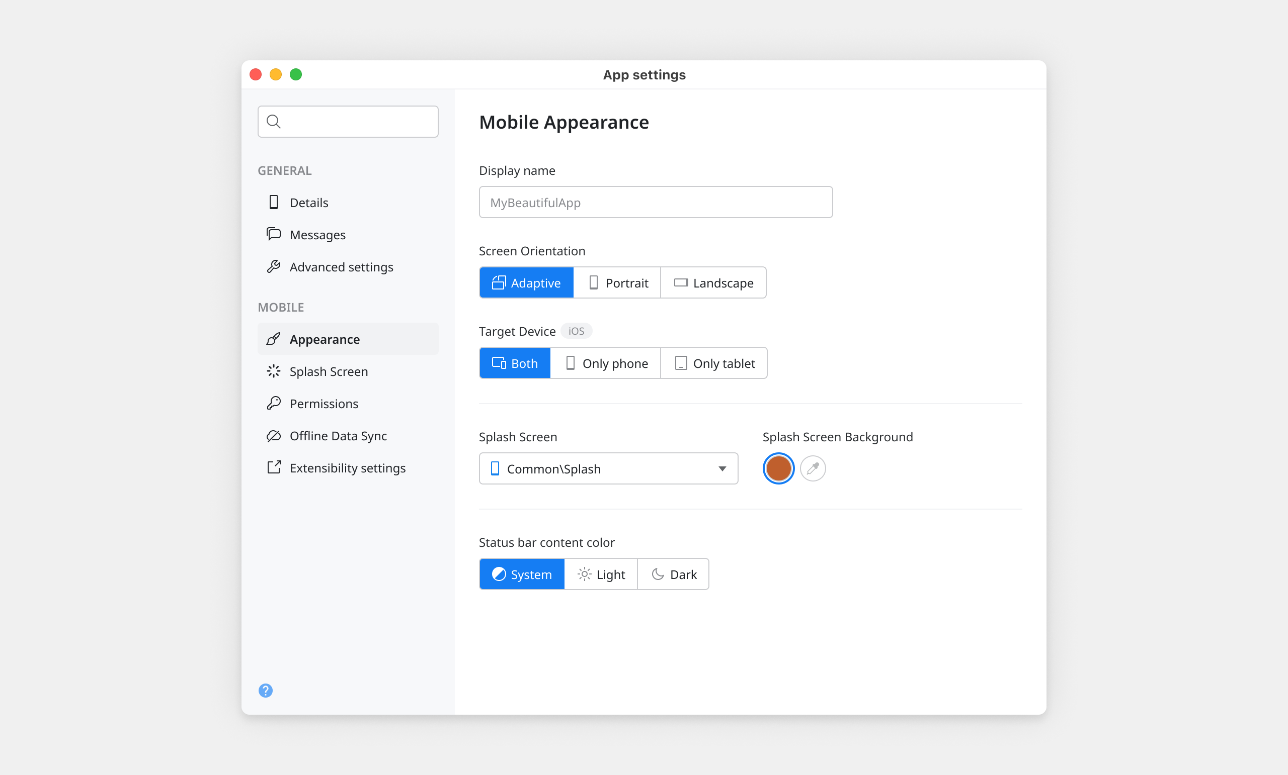
The new dialog replaced the flat tab structure with a resizable surface, minimum 800×650px, anchored by a sidebar-based navigation on the left. Only the sections relevant to the current app type appear, context-awareness visible in the navigation itself, not hidden in logic.
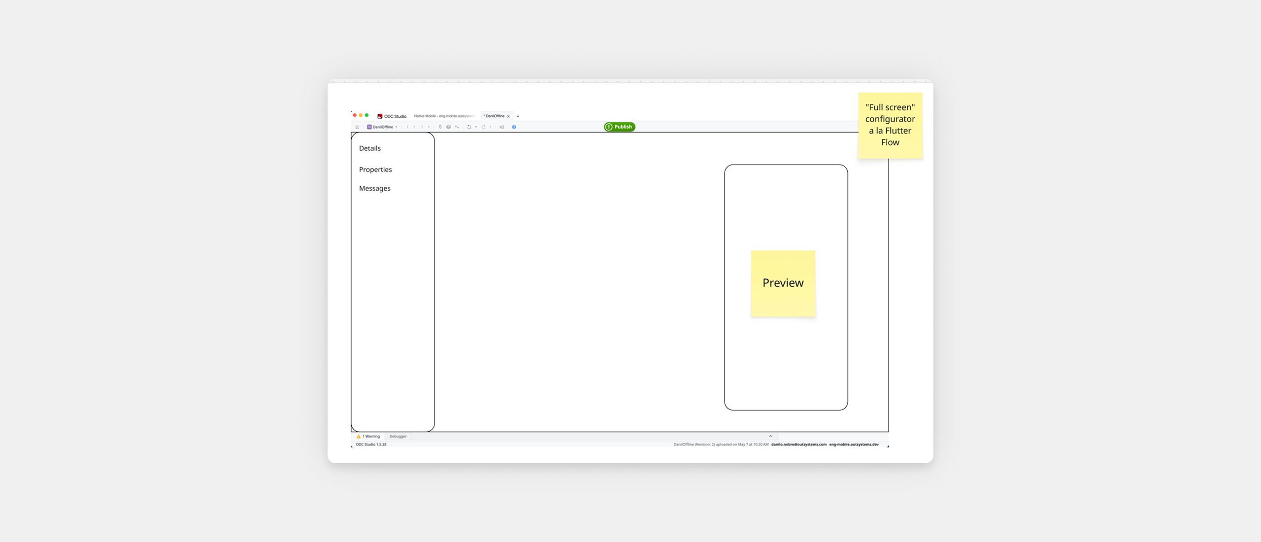
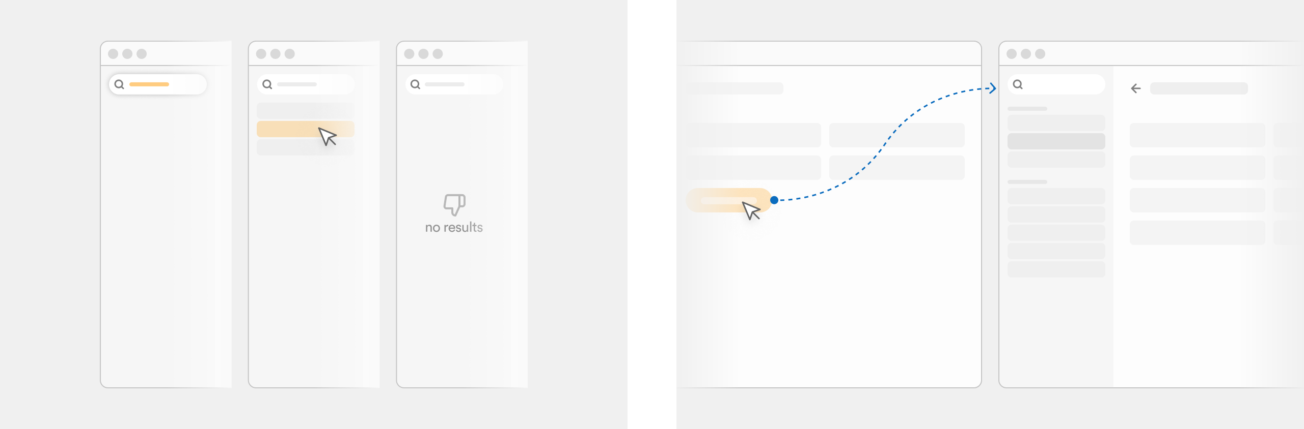
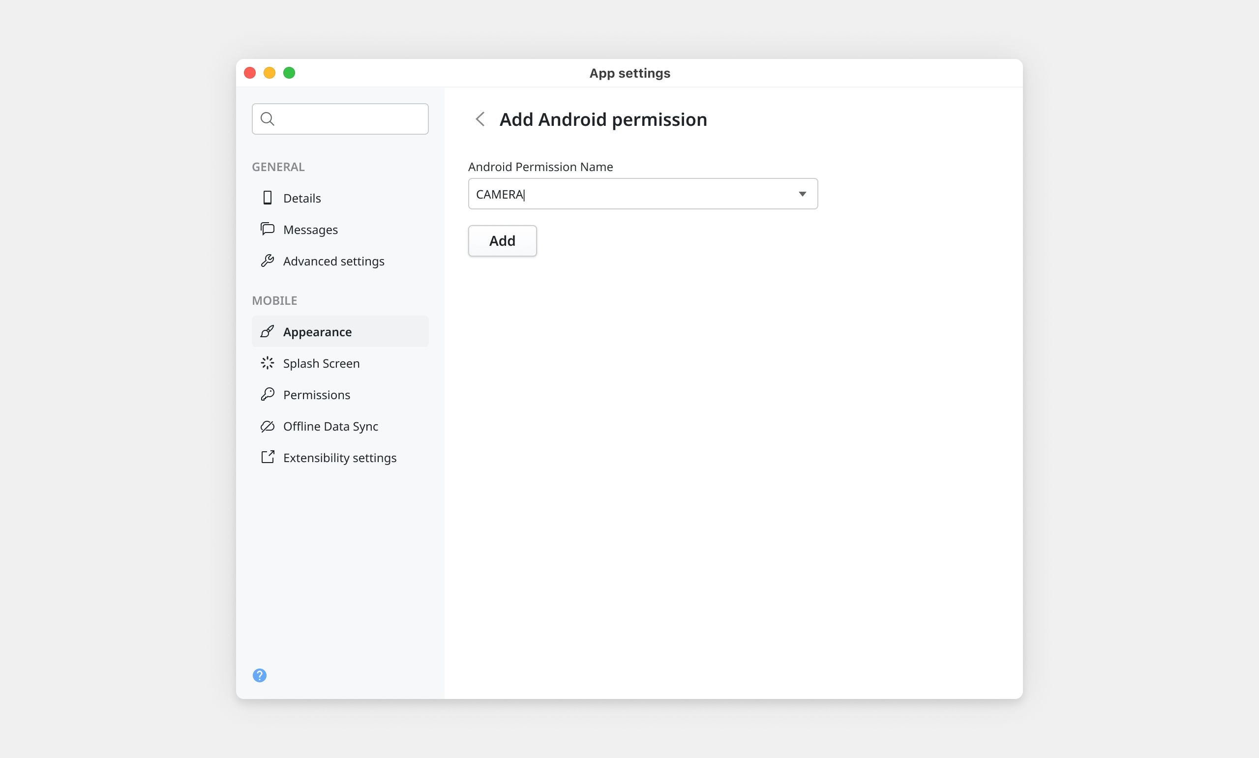
A search input at the top of the sidebar filters settings live as the developer types, opening the corresponding section on selection. For settings that require multiple inputs or conditional logic, a subpage model borrowed from native OS settings keeps the main view clean while making complex configurations accessible through a simple right-arrow affordance.
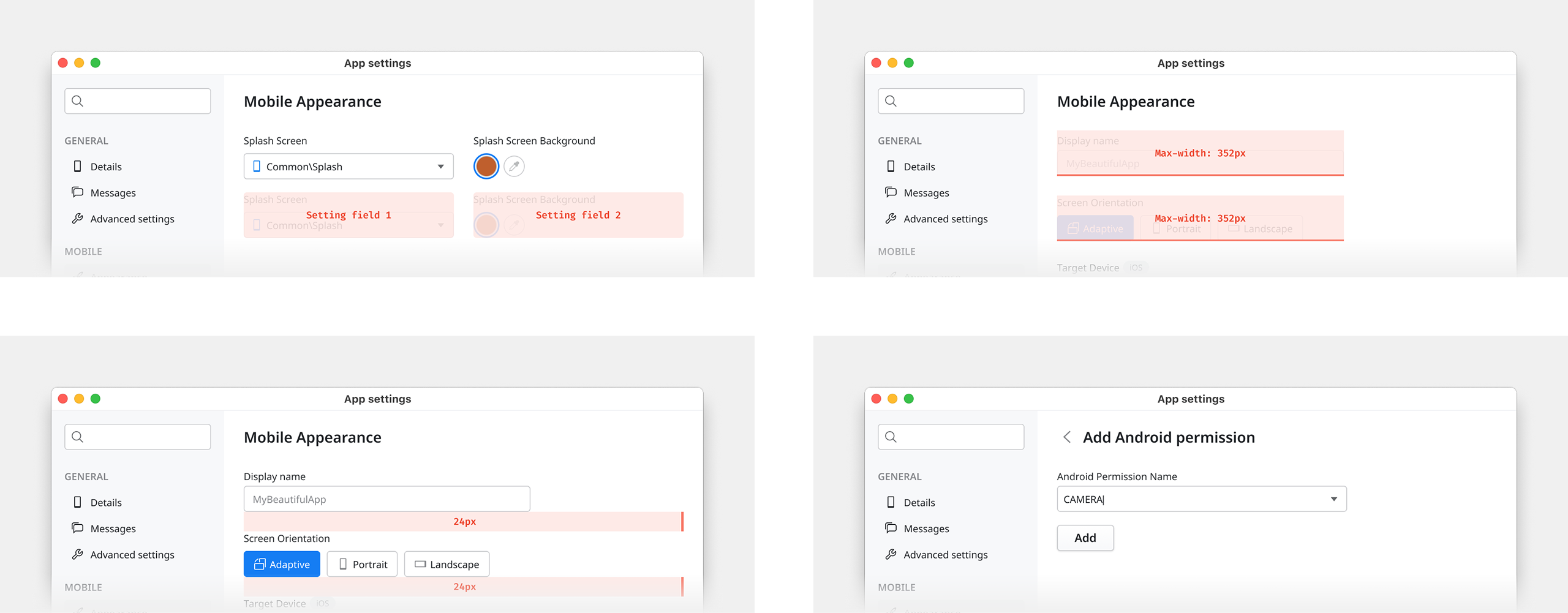
Maximum two fields per row, side by side only when semantically related. Field max-width set at 352px, derived from the product's existing grid, two-thirds of the content area at default dialog size, preventing fields from stretching unnaturally on resize.
Three levels of grouping handle every relationship: tight spacing for related fields, larger spacing between distinct groups, a separator line for strong conceptual boundaries. No new visual patterns needed.
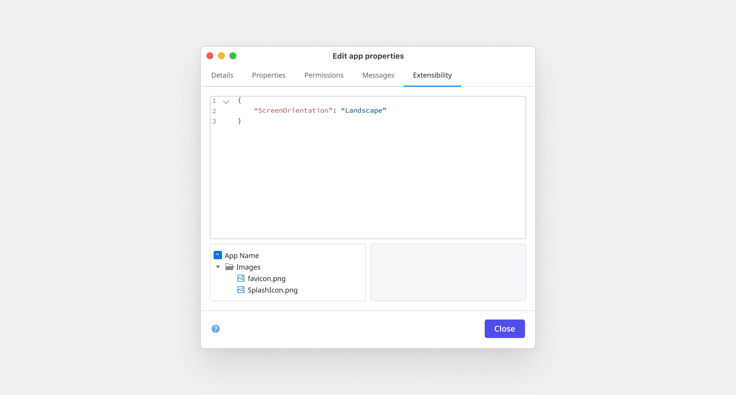
Each Forge plugin that an app consumes can inject its own configuration section into the dialog, with its own tab under a dedicated Forge section in the sidebar, labeled with the plugin's name and icon. Plugin developers get autonomy. Developers consuming plugins get everything in one place.
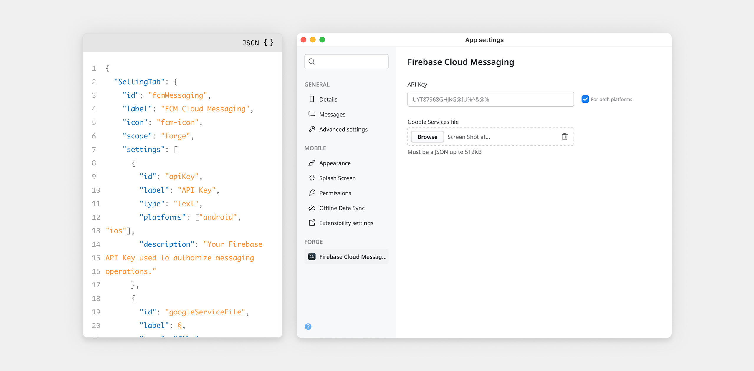
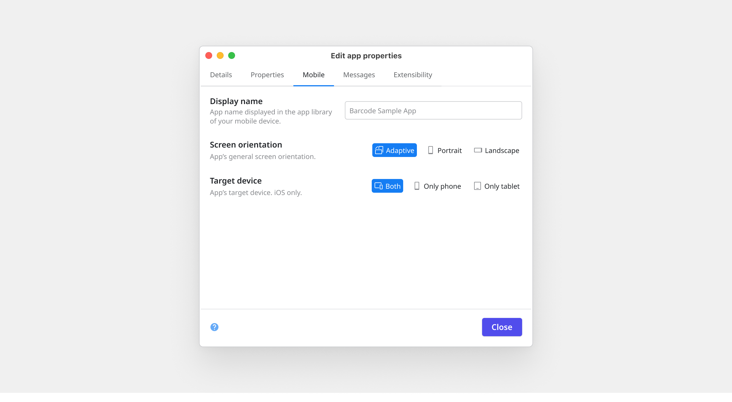
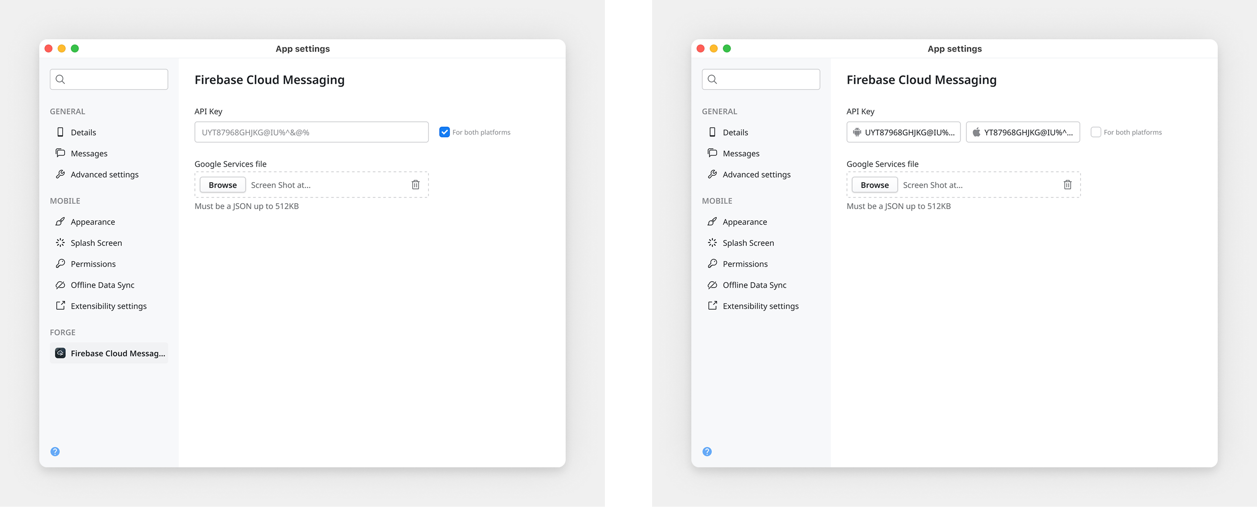
For platform-specific values, after testing multiple approaches including filtering by platform and duplicating settings, we landed on a toggle model. A single shared field by default, split into two when the developer enables it. The majority use case stays clean. The minority gets full support without adding weight for everyone else.
A structured usability study with six OutSystems developers, three internal and three external. The external participants were the more important signal: no insider knowledge of the product's history, no awareness of design decisions in progress. They interacted with the prototype the way a developer encountering the new dialog for the first time would. All six completed every task successfully.
Participants found target settings quickly using both browse and search paths. The sidebar structure was immediately legible. The 352px max-width and two-field-per-row constraint held up well. And the naming, grounded in the object model rather than legacy labels, was confirmed as the clearest option, consistent with the earlier naming study.
The full project is documented in a dedicated Confluence space, including decision rationale, interaction rules, edge cases, and the object model that anchors the system. The Figma file includes a centralized documentation page with annotated flows, platform-specific behaviors, and variation states. I ran onboarding presentations for UX, product, and engineering teams to ensure the system was understood, not just delivered.
Shortly after handoff, I moved to a different team inside OutSystems. Other designers and engineers would be the ones extending this system. That's exactly what it was built for.
